Beyond assuring the size of your elements "makes sense," you should also give some thought to the size of the journaling font you use on your pages. Normally, I try not to put my font size at more than something like a 16pt. font and not less than 10pt. If you go higher than 16pt. with most fonts, the journaling on the printed page (when you eventually print it out) will look huge and out of proportion to the text we would normally write/read. And of course, if you make your font smaller than 10pt in size, with most fonts it will be very small and difficult to read your journaling on the printed page. So, you should always give some thought to "realistic" sizes for both elements and journaling when constructing your pages.
Here I have done a layout as an example. For this layout, I used a template from Trixie's May Templatetopia, and her new GGI kit called Mr. and Mrs. Mouse (staples are the only thing not from this kit). This first one shows a couple of elements a little too big.
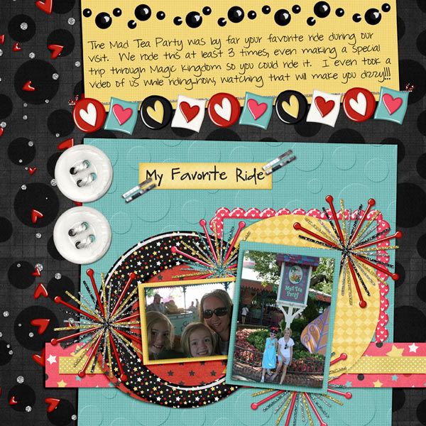
Now, I have adjusted the size of those elements to the right size.

Do you see the difference?
Well, I hope this little tip helps when you sit down to work on your next page:)

All Trixie Scraps Designs products can be found in the following online stores:
Trixie Scraps Shop * Gotta Pixel * Scrapbook Bytes * Funky Playground
No comments:
Post a Comment
Thanks for sharing your thoughts with me!