Here, I have shadowed some elements my "normal" way.
As you can see, they are dark... not obscenely dark, but enough to distract what I am supposed to be looking at; the photo!
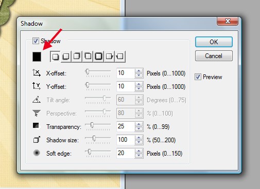
If you look in your program, you should see a little "color" box in your shadowing selection area.
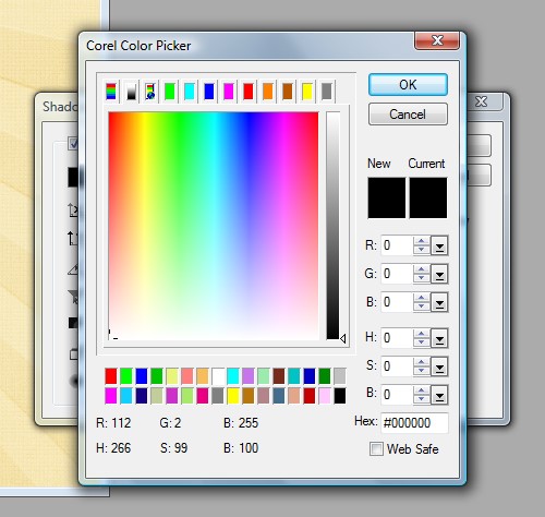
Click on that box and you will see something like this:
Choose a lighter color. For my layout, I went with a lighter grey (R: 62, G: 62, B: 62)
Here is my layout again with my shadow "color" being corrected:
Also, remember that adjusting the color for a realistic shadow is NOT the only thing you have to remember when shadowing. Getting the other settings right is a must... we showed you those settings in our tutorial here.

All Trixie Scraps Designs products can be found in the following online stores:
Trixie Scraps Shop * My Memories * Gotta Pixel * Scrapbook Bytes


No comments:
Post a Comment
Thanks for sharing your thoughts with me!